Saturday, 26 March 2016

Third Draft

I have changed the contents page slightly from my second draft. I changed the main image in the middle and I also added a logo of a festival. I decided to add a logo to give the readers an idea of what kind of festivals will be on that page. I also changed the photograph in the middle as I thought the original one didn't represent my artist in the way that I wanted her to be represented. 

I have also slightly changed my double page spread by making the quote bigger so that it stands out more and I have also changed the way the interview in presented in the the drop cap is on a line on its own and all of the text followed below.


Thursday, 25 February 2016

Evaluation Question Seven

Looking back at your preliminary task, what do you feel you have learnt in the progression from it to the full product?


In progression from the preliminary task to the full product I feel like I have learnt a lot such as how to edit photos effectively. One thing that I learnt was that the lighting is very important to make the image look its best. In my preliminary task I didn't know how to remove blemishes or edit photographs correctly but I feel that I learnt how to do this and how to do it so that it still looks very realistic. Another thing I didn't understand how to use correctly was levels, therefore this is why the photograph in the preliminary task was too dark. 

Evaluation Question Six

What have you learnt about technologies from the process of constructing this product?

Evaluation Question Five

How did you attract/address your audience?


Evaluation Question Four

Who would be the audience for your media product?


Evaluation Question Three

What kind of media institution might distribute your media product and why?


Evaluation Question Two

How does your media product represent particular social groups?


Evaluation Question One

In what ways does your media product use, develop or challenge forms and conventions of real media products?


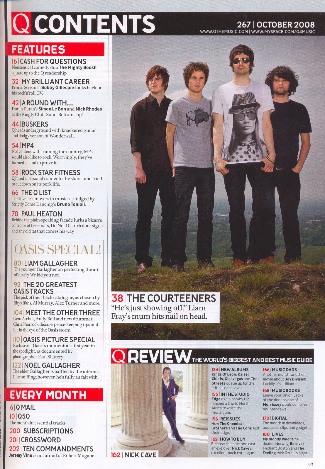
Above are my finished magazine designs for my Front Cover, Contents Page and Double Page Spread, and below I have put an example of Q magazines Front Cover, Contents Page and Double Page spread in order to compare the layout styles I have used, that link with Q magazine.


Below is a Prezi that I created which shows the conventions that I have followed whilst making my music magazine:
 

Friday, 29 January 2016

Contents page and double page spread guidelines

Contents page:

  • Multiple images
  • If just one image per page then do 2 or 3 contents pages
  • Reflect your cover stories
  • Largest image should be the cover star
  • Not all contents is on the contents page
  • Approx 60 pages - Weekly 
  • Approx 140-180 pages - Monthly
  • Divide contents into sections
  • Page number - At least page 6 upwards
  • Subscription offer
  • Letter from the editor
  • Magazine branding - Colour and logos
Double page spread:
  • A3 Landscape - 300 DPI
  • Page numbers
  • Usually towards the end - Weekly - 40 upwards, Monthly - 80-90 upwards 
  • Big letter at the beginning of the first paragraph - Dropped Cap
  • Pull-out quote
  • Columns - Photoshop for graphics, headlines and photos, Publisher - To place in the columns
  • Columns - 6-12 words

Tuesday, 26 January 2016

Front Cover Draft


This is my completed front cover for my magazine. It is different to the other front cover and I have made the mast head bigger, I have also made the artists name bigger and put the feature story in capital letters so that I stands out more, I have also slanted the plug slightly and made it more compact and I think it looks much better this way.

Some other things I did  was retouching her face, enhancing her eyes, eyebrows and her lips. I managed to figure out how to do this by researching it on YouTube and the following tutorials are below:

https://www.youtube.com/watch?v=DmgyRK6H5wk - This is the tutorial I used to touch up her face.
https://www.youtube.com/watch?v=FQ-mafxccuY - Even though this was a tutorial for lips, as well as using it for her lips I also used the same method for her eyebrows and eyes and I found it the most effective and best way.
I have used the pucker tool in Photoshop in order to make the nose slightly smaller, and i have also used the bloat tool to make the eyes slightly bigger as well.


Friday, 18 December 2015

First Front Cover Draft

This is my favourite front cover idea. I liked the one where she is looking over her shoulder as well however I think that this represents the indie genre better than the other one which is why I have chosen this one.

Front Cover Options

I choose to look at this photograph as the guitar represents music well and I thought the framing would be right.

I chose this Photograph as I thought it was a similar style and framing to the mock up I did of Lana Del Rey.

I choose this photograph as I wanted to show some variety in my images and I think I have done this by using this photograph.

I choose this photograph as I think it was one of the better ones for a front cover that I choose and I thought the framing's were right. 

Again, I choose this photograph as the framing's were right and it was one of the best options for the front cover.


I choose this photograph as I think that it is more edgy than some of the other images that I took and it is similar to the cover of Land Del Rey, of who my magazine is based around.


These are all of the potential front covers for my magazine, I decided to do this so that could then choose the one that I think is the best.

Photographs For Magazine

These are before and after shots of the make-up and hair I did for the photo shoot.


These are all of the photography that I have taken for my magazine


Thursday, 1 October 2015

Google mock up ideas

This is the first Google mock up idea I did for my front cover, I chose Lana Del Rey as my feature artist as she links really well to my genre and my survey results suggests she would be a popular choice. I chose to do a light pink, white and black colour scheme because when I looked at some existing indie magazines they tended to be quite pale and I thought they worked well together. However, when i put everything together I didn't think it quite worked so I changed it.
This is the final Google mock up for my magazine and I much prefer this as I think both the colour scheme and the image of  Lana Del Rey have a much more edgy feel and link better to the genre of indie. 

These are two of the Google mock ups I did first for my contents page, I did one is red as well as in pink as I changed my colour scheme after I had already done the contents page.
This is another Google mock up I did for my contents page, however I don't quite like it because There is too many pictures of Lana Del Rey on it therefore it seems like it is just a magazine on her and no other artists.
This is my final Google mock up idea for my contents page and I think the colour scheme works really well and I like the organisation of photography and the fact that there is loads of artists included in it and not just one. I have kept Lana Del Rey's image the largest as she is the feature artist in this issue.
This is the first Google mock up that I did for my double page spread, I think the image works well on it however I am not very keen on the whole page all together.

This is my final Google mock up idea for my double page spread and I really like it as it is very simple but effective.