 |
| This is my favourite front cover idea. I liked the one where she is looking over her shoulder as well however I think that this represents the indie genre better than the other one which is why I have chosen this one. |
Friday, 18 December 2015
First Front Cover Draft

Front Cover Options
 |
| I choose to look at this photograph as the guitar represents music well and I thought the framing would be right. |
 |
| I chose this Photograph as I thought it was a similar style and framing to the mock up I did of Lana Del Rey. |
 |
| I choose this photograph as I wanted to show some variety in my images and I think I have done this by using this photograph. |
 |
| I choose this photograph as I think it was one of the better ones for a front cover that I choose and I thought the framing's were right. |
 |
| Again, I choose this photograph as the framing's were right and it was one of the best options for the front cover. |
 |
| I choose this photograph as I think that it is more edgy than some of the other images that I took and it is similar to the cover of Land Del Rey, of who my magazine is based around. |
These are all of the potential front covers for my magazine, I decided to do this so that could then choose the one that I think is the best.
Photographs For Magazine
These are before and after shots of the make-up and hair I did for the photo shoot.


Thursday, 1 October 2015
Google mock up ideas

|


Contents page house styles

Double page spread house styles

In each of these three magazine issues, the picture of the artist takes up at least one A4 size photograph but mostly a full A3 size photograph. This is because they are the main feature in this issue therefore they want to make them stand out.
A dropped cap is also used quite often, this is shown in the top left and top right magazine issues.
There is also usually quotes from the artists or text bout them, or an interview, this is because the reader wants to find out about the artist.
Colour scheme ideas, Name ideas and feature story ideas

|


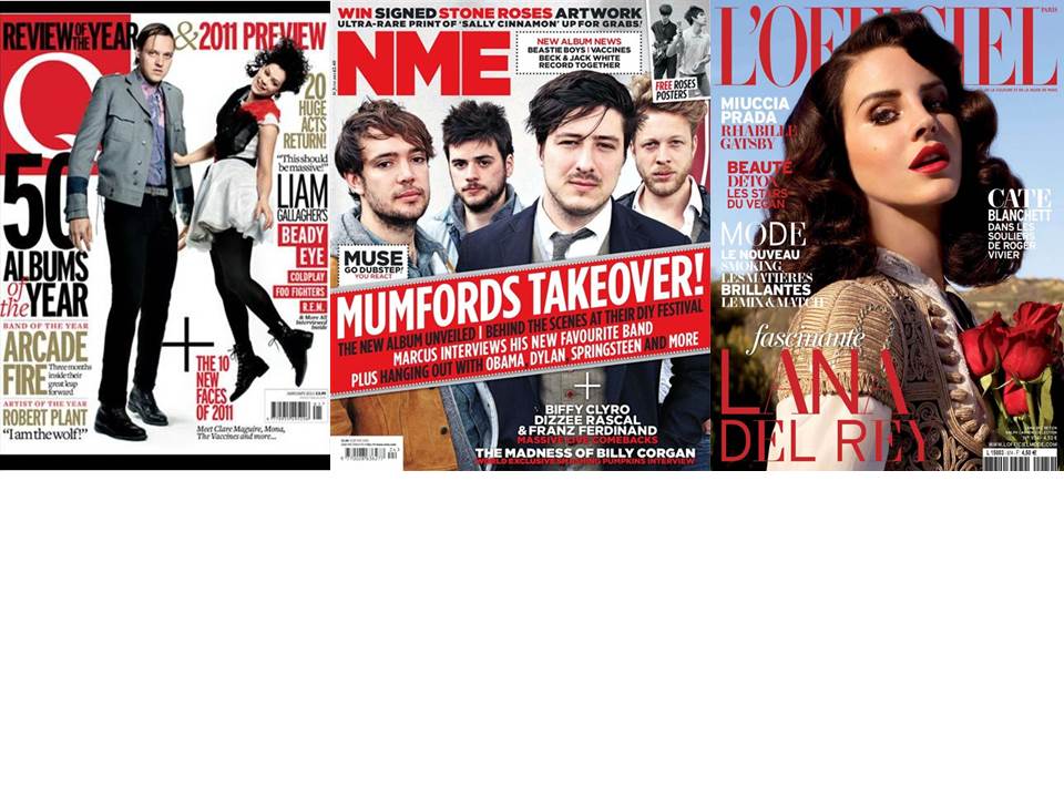
Mise-en-scene location and prop ideas
One location I would like to shoot some of my images is against a white wall/ in a studio and this is because lots of magazines use this and I think they make the photograph look very professional.
Another location will be outside against a flowery background as I think this links well the the indie genre.
I think these location ideas will appeal to my audience because based on my survey, the results show that the most favoured artist was Lana Del Rey and a lot of her images are very summary and include flowers either in the background or as a prop, which is why I am going to try and include flowers in my props as well.
Another prop I would like to use is a guitar as this is highly associated with the indie genre and I think it will work really well on my double page spread and contents page, however I don't think I would use it on my front cover as I want the actual artist to be the main focus.
Costume designs
 |
| I have chosen these outfits because I think that they work well with the genre indie and also because one of my main inspirations for this project is Lana Del Rey and based on the research that I have done, I think these styles are similar to how she would dress. |
Social class & demographic of my product
I will be aiming my magazine at working class people as from my target audience, it seems that they are dominantly of a young age therefore are likely to not have a big career as of yet.
The price of my magazine will be £2.99 and i have chosen this based on my questionnaire and what i think would be most appropriate.
My social class would prefer free gifts such as a free CD or a money off voucher.
Subscribe to:
Posts (Atom)