Brief:
To design a front cover, contents and double page spread of a new music magazine. All images and text used must be original, a minimum of four images must be used.
Sunday, 27 September 2015
Friday, 25 September 2015
Finished Front Cover And Draft Contents Page
Evaluation Questions
How have you used technology?
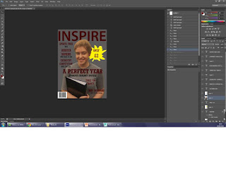
I have used an SLR camera to take the pictures for my front cover. I have also used Photoshop to create the front cover of the magazine, i used this in order to put it all together for example i used it to get rid of the background of the photograph so that it didn't take away the attention from the main image, which is obviously the girl. I also used it to add text to the cover so that the audience would know what they were buying and what was going to be in it. Another i used it for was to add a background and to get pictures such as the bar code.
What conventions have you used and why?
I have used a Masthead, this is so the audience will know what magazine they are about to buy. I have used a skyline to give the reader information on what is inside the magazine, this is also why i included many feature stories. I also used a plug and made it a bright yellow so that it stood out and also so that people knew how much the magazine was. Another convention i used was the bar code and date, this was so the reader knows when it was published. I also added a footer and i included a chance to win an iPhone 6 in it, in the hope that that it persuades people to buy my magazine.
What would you change if you were to do this task again?
If i was to do this again i wouldn't use a splat for the plug i would use a more simple shape such as a circle or a square, this is because i think the splat looks slightly childish and this doesn't go with the theme of the rest of the magazine.
Mise-en-scene and location ideas
Photographs for front cover
 |
| I like that she is holding a book as she in interacting with college work however the quality isn't good quality therefore i wont use this. |
 |
| I like that she is smiling and holding folders as it looks like she is enjoying college, however the quality is low therefore i wont use this one. |
 |
| I like this picture because she is smiling, however it is too dark and she is not holing anything so i will not be using this image. |
 |
| This image is a possibility however i would prefer it if the picture was better quality. |
 |
| I like this image because it is good quality and she looks happy to be at college, therefore this is an option. |
 |
| This is also an option as it is a good quality picture and it works well with the theme of my magazine, which is a general college magazine. |
Creating The Front Cover
 |
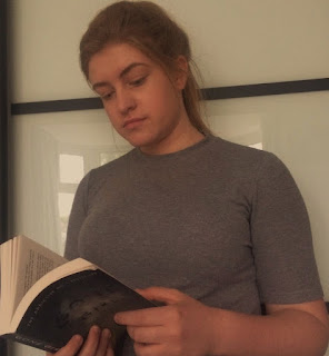
| I started by getting rid of the background of the picture using the quick selection tool. i did this as it will help the image stand out better on the magazine. |
 |
| I then added the Masthead and changed the size, font and colour to how i wanted it. I also added the bar code to the bottom of the page. |
 |
| I then added a grey background so that it works well with the picture and colour theme. I also added the date above the bar code. |
 |
| I then added the main stories and cover stories with appropriate colours and fonts. I also added a plug. |
 |
| I moved the text and re-sized it so it was in the right place in relation to the main image. |
 |
| I then changed the main image as it is better quality and worked better so i then adjusted the text slightly to fit well. |
 |
| Finally, i added the skyline and the Footer. |
Wednesday, 23 September 2015
Sunday, 20 September 2015
Framings
Thursday, 17 September 2015
Feature Story Ideas
Some feature stories could be:
- FORMER STUDENT WINS PLACE AT 'LIPA'
- BEN UNDERWOOD AND JACK WALLER ESTABLISH 'NEONN VIDEO' PRODUCTION COMPANY
- REBECCA HOPKINS GAINS PLACE AT ST. MARTINS COLLEGE
- ROB ARAMAYO CAST IN HBO DRAMA
- THE FILM INDUSTRY AT WYKE
- GEORGIA ROE PROGRESSED TO PROFESSIONAL TRAINING AT NEW YORK FILM ACADEMY
- CHARLOTTE FRANK WORKING FOR THE LARGEST WORLDS LARGEST ADVERTISING AGENCIES
- RECORD NUMBER OF STUDENTS APPLYING FOR SUBJECTS WITHIN THE ART DEPARTMENT
- OVER 50% OF PHOTOGRAPHY STUDENTS WENT ONTO STUDY PHOTOGRAPHY AT UNIVERSITY LAST YEAR
Colour Scheme
Magazine Name
Some magazine names for a Arts and Drama subjects are:
- Creative
- Inspire
- Inspired
- Original
- Imaginative
- Artistry
- Craft
- Arts
- Design
- Illustrated
- My favourite of these are Inspire, Imaginative and Illustrated.
Some magazine names for a sports Magazine are:
- Athletic
- Action
- Score
- Sports
- My favourite of these is Action.
Some magazine names for a general college magazine are:
- Alert
- Your College
- Student Weekly
- Inspire
- My favourite of these is Alert.
Mood Board
Monday, 14 September 2015
Key Concepts
Language
- Language is the way a media text is conveyed to the audience.
- What particular medium are you looking at?
- What is its terminology?
- This includes Photographs and Graphic Elements.
Institution
- The institution means who is the producer of the media text and what effect does this have on the final product?
- Examples are, Apple, BBC and Viking Radio.
Ideology
- What values are explicit?
- What values are implicit?
- What ideas are involved?
Audience
- Who is it targeted at?
- What do people do with it?
- Whose needs does it fulfill?
Representation
- How do they represent different groups?
- What individuals or groups appear in it?
- How are they portrayed?
- For example, do they appear to be aggressive or beautiful?
The Unicorn Trebor Advert:
The camera is pointing at the unicorn's face, a woman's hand and a mint that the woman is holding.. We know this is a woman's hand as she is holding a long-sleeved velvet glove, with accessories that appear to be very expensive such as a ring and a bracelet . The positioning of the unicorn and the person has the effect that the unicorn is superior in size, which therefore links to the word 'discerning' from the slogan.
The white infinity screen in the background, although may seem odd against a white unicorn and a mint actually works very well as it emphasises freedom. As well as the unicorn, the white background also creates an element of fantasy. The white background also represents wealth and luxury, as does the velvet glove and jewellery, which is highly contrasted against the white background to make it significantly stand out. The set up of the photograph where the viewer can't see whose arm it is, prevents the them from being distracted from the product and the message they are trying to get across.
The accessories in this advert that connote wealth such as the long-sleeved velvet glove and the diamond jewellery are there to highlight the quality of the mints they are selling. the fact a very elegant classy woman is feeding the unicorn a mint and not a stable girl feeding a mint to a pony suggests that Trebor want to viewers to understand that these mint are of much higher quality. The actual product itself is centered at the bottom of the advert. It draws in lots of attention as it is the only part of the advert that uses strong colours.
Brief
To design a College magazine front cover and mock up contents page. Images used on the front cover must be original.
Subscribe to:
Comments (Atom)


